©Museu d’Art Contemporani de Barcelona / © Josep Maria Mestres Quadreny
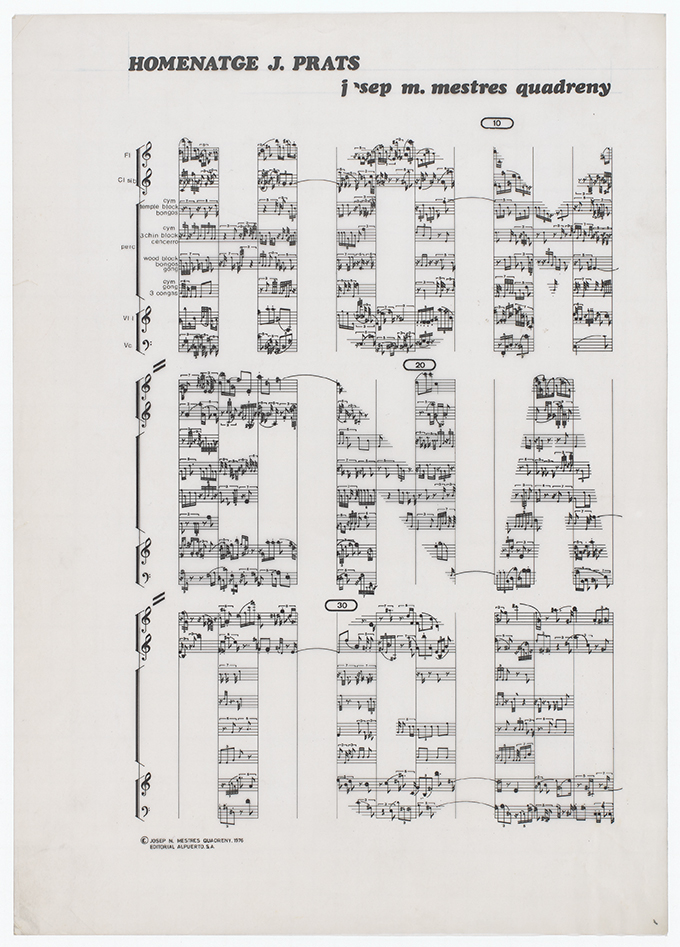
Josep Maria Mestres Quadreny was a Spanish composer and one of the most significant innovators and disseminators of contemporary music in Catalonia. His work spans several areas, from conventional scoring to graphic scoring, from the use of computers to composition based on mathematical algorithms and theories of chance. In addition to being one of the pioneers in Spain in the use of computers to generate compositions, he was also a pioneer in the creation of graphic scores beyond the conventional staff.
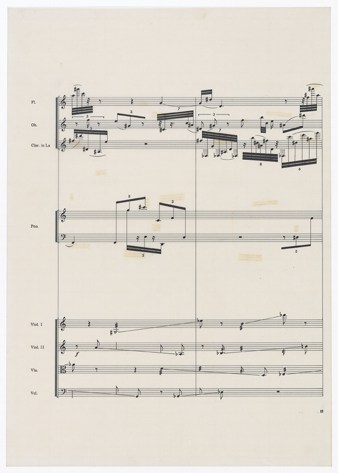
Among the works influenced by these influences is the “Quartet de Catroc” composed in 1962. This graphic score contains three movements or pieces, with three different textures, which the musicians must interpret at different tempos, chosen at random, thus giving rise to a very rich and infinite combination of sound textures.
 Quartet de Catroc
©Museu d’Art Contemporani de Barcelona / © Josep Maria Mestres Quadreny
Another innovative work is “Self-service” composed in 1973, which is to be performed by the audience itself. The score consists of four plans for four different groups of instruments, flutes and different percussion instruments. For the construction of this graphic score, he had access to several city maps with their streets, where instead of cars, musical notes circulate in a totally random way. The one presented below corresponds to Barcelona’s Ensanche, with Urgell Street, where the Industrial School is symbolically located, as the main central axis.

©Museu d’Art Contemporani de Barcelona / © Josep Maria Mestres Quadreny
Contemporary Art Museum of Barcelona, hired my colleague and friend Hugo Rodríguez and me to reproduce almost four hundred works by the author. The difficulty of the assignment was not so much that there was some color that was out of gamut but to reproduce the chromatic fidelity of the various papers used, as well as to maintain the subtle gradients of the ink used. On the other hand, some supports had a certain transparency and this had to be seen.
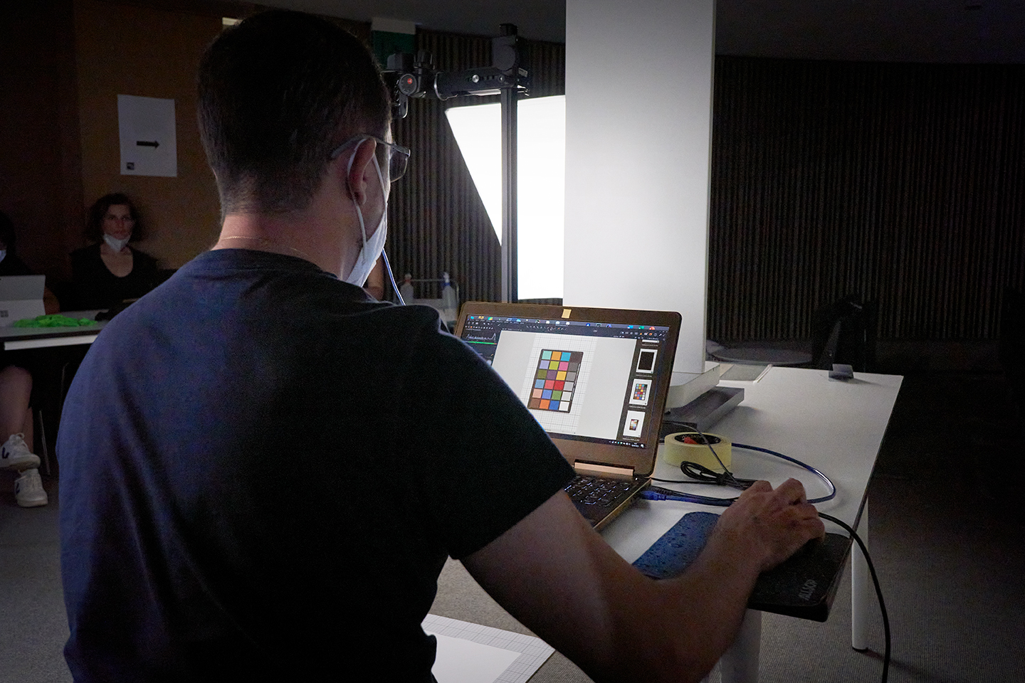
The shots were taken at the museum itself and Hugo did the color management in his studio. Hugo is one of the most prestigious color managers in Spain and this job was a major challenge. The first day we went to the museum together as we had to generate a color profile for the camera and the specific lights we had worked with.
Hugo had already developed IT8 charts for the EGM laboratory in Barcelona, synonymous with the highest quality in image copying in the country. Already in 2014, the Department of Photography of the Metropolitan Museum of Art in New York had acquired it for the reproduction of a collection of more than eleven thousand photographs from its archive. However for this assignment he used the HR-1 SuperChroma™ chart that he developed after nearly 4 years of research. A new menu that surpasses any previous edition.
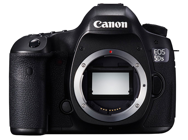
For the digital captures I used a high quality Canon body, the EOS 5Ds, with a 50.6 MP sensor. In addition, this camera can cancel the low-pass filter if necessary, thus achieving a sharper capture performance. Another important aspect was the choice of optics. Of the various lenses available to me, the final choice was a Canon 100 mm macro and a Nikon 50 mm. After several tests with adjustment charts, these two lenses minimized chromatic and geometric aberrations, ensuring the best reproduction quality.
 Canon EOS 5Ds
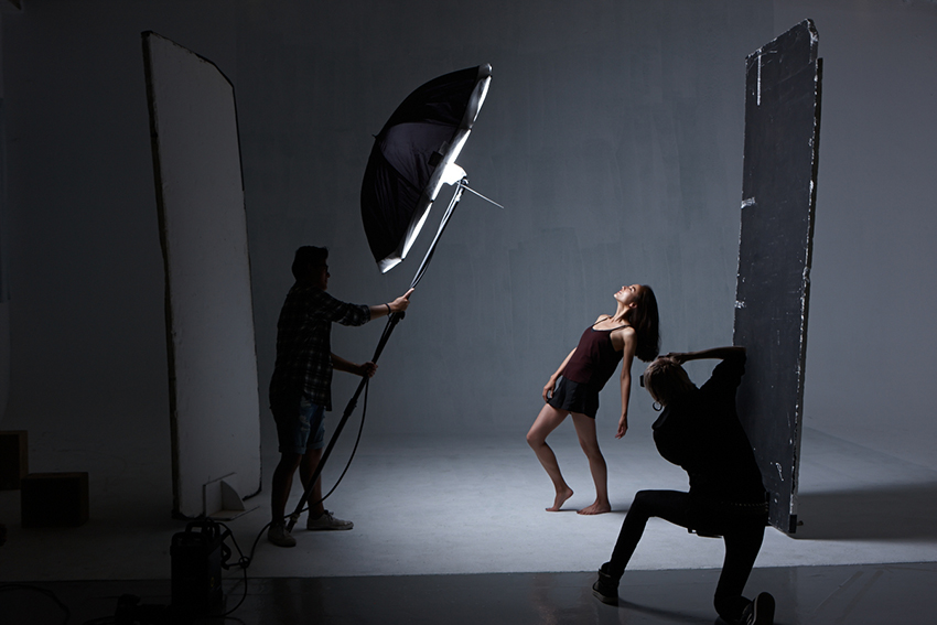
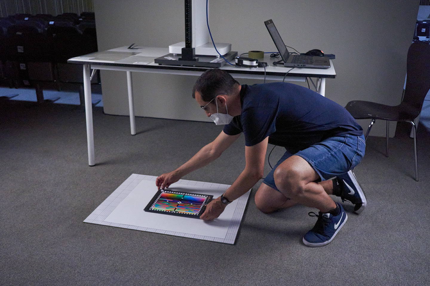
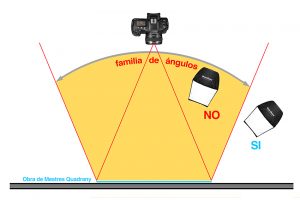
Several of the works were framed with glass and could not be removed. We must avoid seeing the reflections produced and for this it is necessary to dwell on the concept of “family of angles that produce a direct reflection”. In this sense it is very important that from the position of the camera we do not see any direct reflection of the light sources used to take the photograph. Any light located outside the family of angles that produces direct reflections from the light source will be well placed to begin work. It is also important to position the camera away from the subject because if we are forced to place the camera close to the work, the family of angles that will produce direct reflections will be greater and will force us to place the light too close to the plane of the work and the shadows of the frame will be greater.
 Family of angles
As always, before taking photographs, a reference color chart should be photographed as it will not only help us to set the white balance correctly but will also help us to evaluate the appropriate brightness. I usually use Gretag Macbeth’s 24-patch Color Checker, which has always proved to be very effective. This chart provides a completely objective standard of comparison to help determine the true color balance of any color rendering system.
 Color Checker
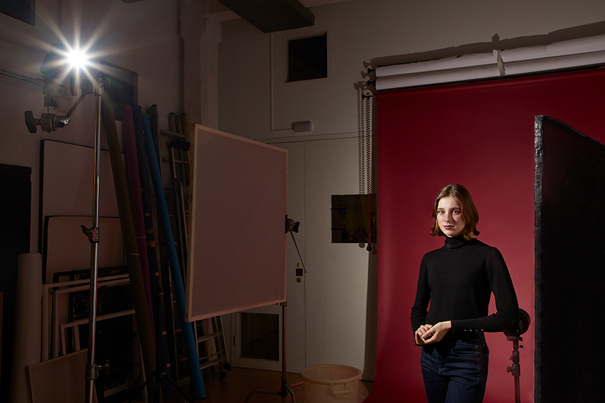
When shooting, the first thing to do is to achieve an even distribution of light on the scene plane. I usually work with two rectangular windows as close as possible to the work in order to achieve a greater diffusion of light. In this case I worked with Godox AD300 Pro flashes and windows, which proved to be very effective, as we previously analyzed the color quality with Hugo and it gave us a surprising result of a CRI of 98%. The CRI value of a light source is calculated by comparing the appearance of a given color sample with the appearance of the same range of colors under natural midday light.
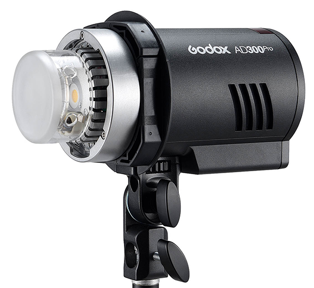 Godox AD300 Pro

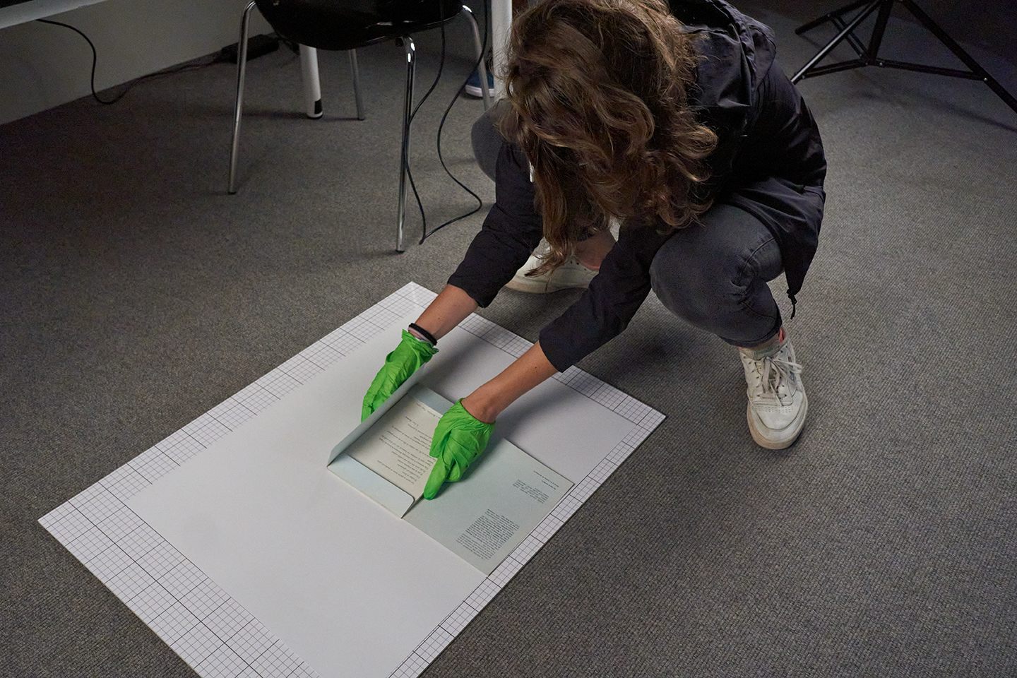
Many of the scores were not framed and we photographed them on the floor with a special glass for museums, which in addition to being anti-reflective has no color cast whatsoever. As always and in this case too, the lights should be positioned outside the “family of angles”.
©Museu d’Art Contemporani de Barcelona / © Josep Maria Mestres Quadreny
I must also highlight the convenience of working with a great monitor from BenQ’s professional range, the SW321C. It is a 32-inch 4K UHD display with Paper Color Sync technology developed to coordinate the color of the screen and photos. This monitor provides the ultimate platform for accurate photo editing and reliable reproduction of printed photo output. It employs special techniques on the panels to further reduce reflection and glare, resulting in a paper-like screen effect that works in conjunction with Paper Color Sync to ensure that photos look almost the same on the screen as they do on paper.

©Museu d’Art Contemporani de Barcelona / © Josep Maria Mestres Quadreny
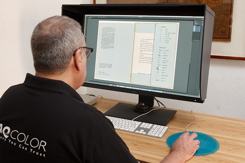
 BenQ SW321C
Finally I must say that the light intensity values on the works do not coincide with the diaphragm values that I finally used in the captures. This is due to another important aspect of color management, which refers to processing files with the histogram as far to the right as possible, without “clashing” at the right edge of the histogram. Also of great importance is the software with which the raw files are processed. In this sense, Capture One has a much more developed unsharp mask than Lightroom or Camera Raw, in addition to correcting possible geometric aberrations in a more effective way. But I leave the issue of the prosecution in the hands of Hugo, who will surely write an article soon on his blog about this MACBA assignment.
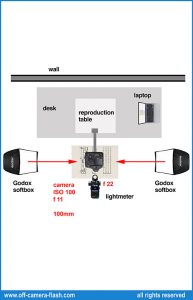 Lighting scheme
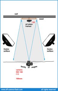 Lighting scheme
All rights reserved. © Isarrualde Photography
Any partial or total reproduction is prohibited without the written consent of the author.