Algunos trabajos fotográficos son verdaderamente difíciles de realizar en la era digital, y uno de ellos son las reproducciones de obras de arte. La fidelidad de los colores debe ser máxima y llegar a ellos es una tarea de alta precisión en toda la secuencia del encargo. Pero vayamos primero a la iluminación, que es de lo que se trata este blog. Al fotografiar una obra de arte – o cualquier otro motivo – nuestra principal preocupación en cuanto a la luz será su brillo, color y contraste.
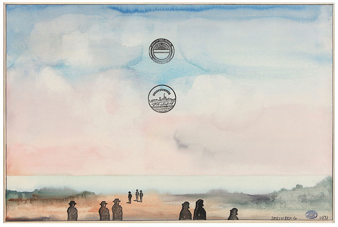
Saúl Steinberg
Realizo con frecuencia las reproducciones de obras de arte para la Galería A34 de Barcelona, además de trabajar para otros clientes en este tema, como cuando realicé las reproducciones de la obra de mi querido amigo Yamandú Canosa para la Fundación Suñol o trabajé para el CCCB fotografiando los automóviles Pegaso.
Galería A34
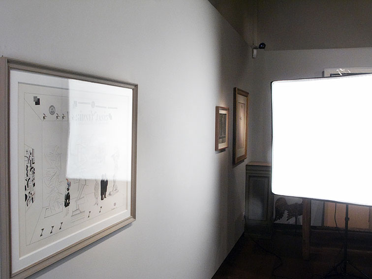
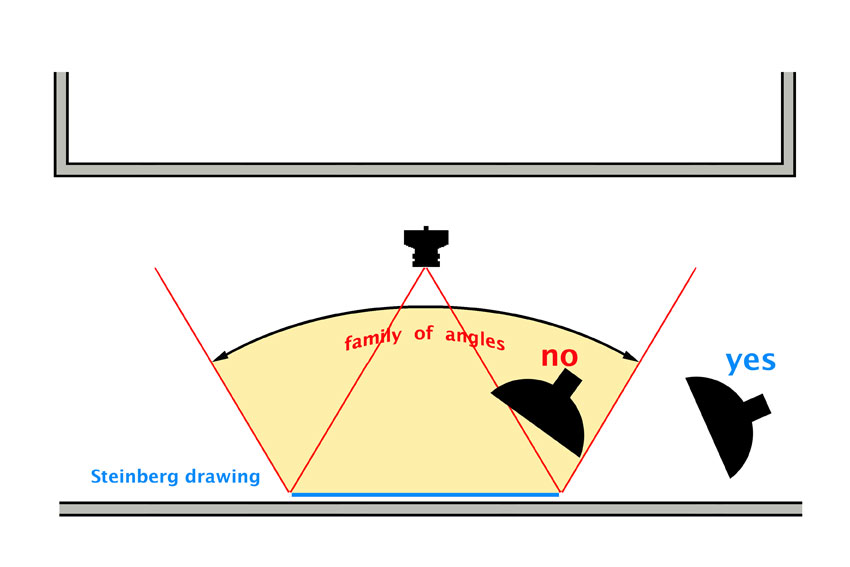
Muchas obras están enmarcadas y el cristal se convierte en el principal problema. Debemos evitar ver los reflejos producidos y para ello es necesario detenerse en el concepto de «familia de ángulos que producen un reflejo directo».
Reflejo directo
La fotografía anterior nos enseña un reflejo directo. Aquí vemos reflejado sobre el cristal el reflejo directo que produce una de las cajas de luz que utilicé para realizar la reproducción. En éste sentido es muy importante que desde la posición de la cámara no veamos ningún reflejo directo de las fuentes de luces utilizadas para realizar la fotografía.
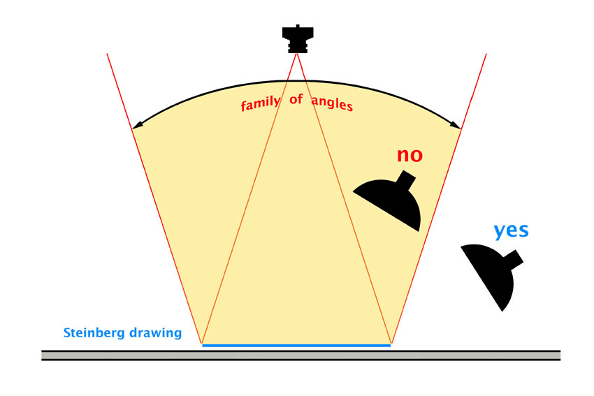
Familia de ángulos
Cualquier luz situada fuera de la familia de ángulos que produce reflejos directos de la fuente de luz, estará bien ubicada para comenzar a realizar el trabajo. Es importante posicionar la cámara alejada del motivo ya que si nos vemos obligados a colocar la cámara cerca de la obra, la familia de ángulos que producirá reflejos directos será mayor y nos obligará a poner la luz demasiado rasante al plano de la obra y las sombras del marco serán mayores.
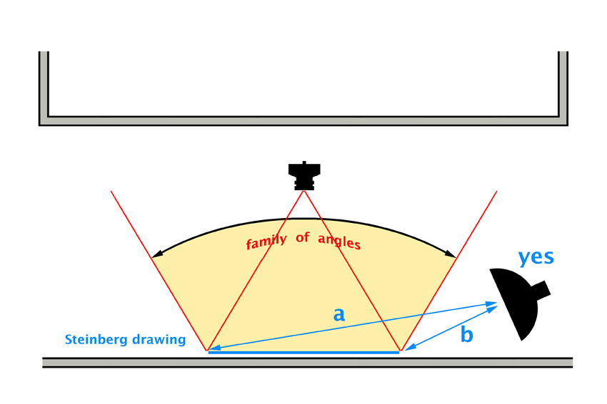
Otro aspecto esencial es que llegue a la superficie de la obra la misma cantidad de luz. En este sentido es importante que la fuente de luz esté alejada de la obra para que la luz se distribuya de manera homogénea. La ley de la inversa del cuadrado de la distancia nos recuerda que a mayor distancia menor cantidad de luz y debemos evitar los degradados de luz sobre la pieza. Por otra parte los reflejos difusos se hacen más brillantes a medida que la luz se acerca a la superficie reflectante. Debemos intentar que las distancias a y b del siguiente dibujo sean lo mas parecidas posibles. En el excelente libro de Hunter, Biver y Faqua podéis ver este tema desarrollado con mayor extensión.
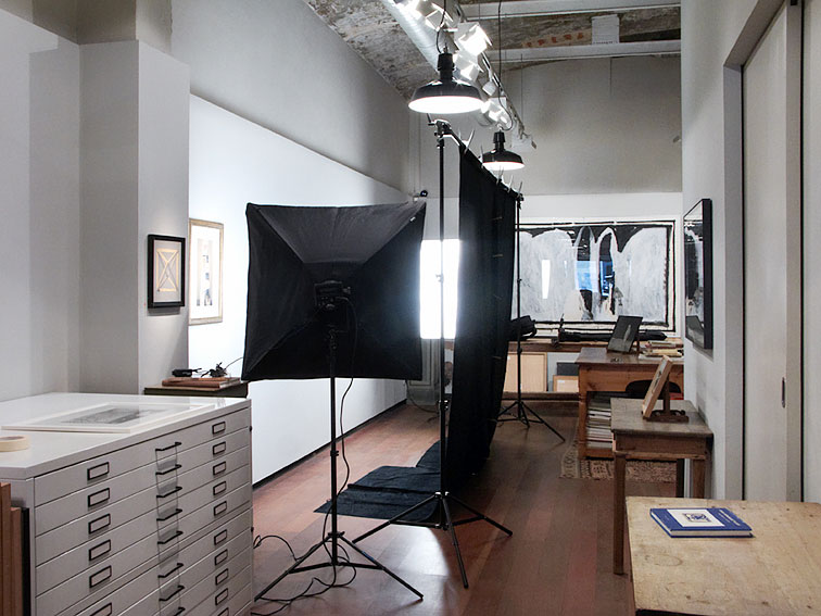
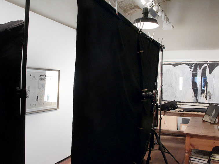
Si se trata de dibujos que no tienen relieve prefiero trabajar con cajas de luz grandes para lograr que las sombras producidas por el marco sean suaves y de bajo contraste ya que si el marco es muy profundo se verán de manera notoria y si la luz utilizada es dura no habrá transición entre las áreas en luz y sombra sobre la obra y será mas difícil de retocar en la post producción.Un detalle importante cuando las obras tienen cristal es colocar en el plano de la cámara una tela de terciopelo negro para garantizar que se absorberán todos los reflejos que podrían aparecer de la habitación en el cristal de la obra.
A veces tenemos suerte y las obras no tienen marcos con cristal, y si además fueron realizadas sobre papeles mate solo debemos poner bien la luz. Dos luces simétricas, equidistantes de la obra y con el mismo ángulo de incidencia, será suficiente. En mi caso suelo utilizar para éstos trabajos cajas de luz Wafer y flashes Bowens.

Joaquín Torres García
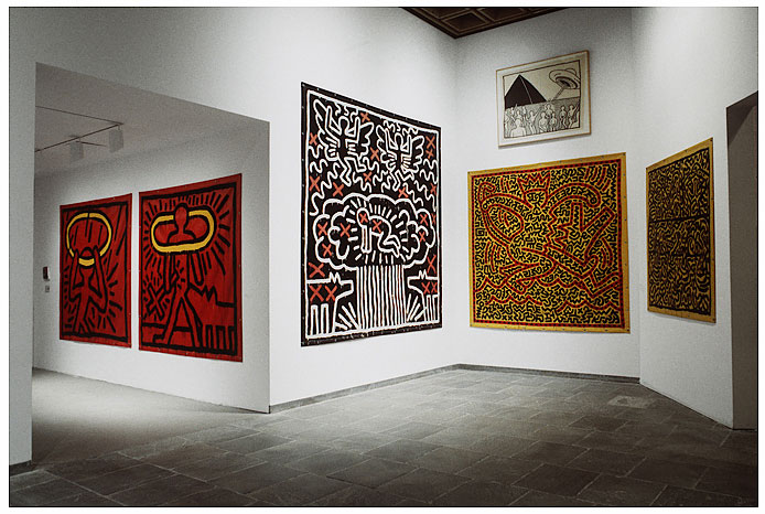
Recuerdo hace unos años realizar un reportaje sobre la exhibición de las obras de Keith Haring en el Whitney Museum de New York, donde no pude iluminar la obra y solo conté con una hora para el encargo. Las obras estaban muy bien iluminadas pero varias de ellas estaban realizadas sobre lonas satinadas. A veces no se puede hacer lo que uno sabe que debe hacerse y debe resolver el problema con los escasos recursos disponibles. En este caso opte por alejarme de la obra y buscar ángulos de toma que evitasen los reflejos directos, aunque no fue posible en todas las obras.
Whitney Museum © Marcelo Isarrualde
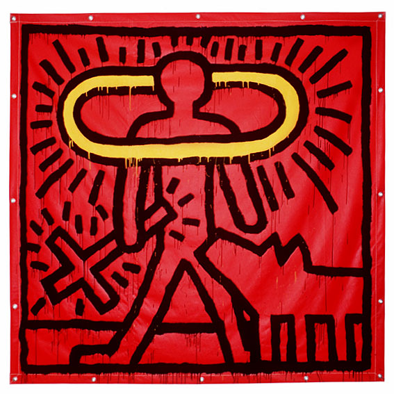
Keith Haring © Marcelo Isarrualde
La gestión del color en la era digital
La gestión del color en la reproducción de obras de arte es un tema fundamental y en la era digital no es algo sencillo. En primer lugar habría que saber con que fuentes de luces se va a trabajar y generar un perfil para el sensor de la cámara y esas luces. En su día tuve la suerte que mi amigo Hugo Rodríguez lo elaboró para mi equipo cuando tuve que realizar unas reproducciones muy difíciles de la obra de Joan Miró. Parte de los tonos rojos y azules de sus obras se situaban fuera del espacio de color reproducible en una imprenta y había que saber que decisiones tomar al respecto en el tratamiento del color.
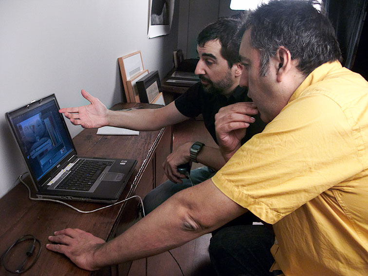
Con Hugo Rodriguez
Éste tipo de trabajo implica disparar un «bracketing» de exposiciones, revelar el archivo raw con el perfil desarrollado y con una curva en respuesta lineal. En éstas circunstancias a su vez hay que hacer un balance de blancos y evaluar el mejor histograma resultante para su revelado. También habría que comparar los valores de la carta Color Checker Gretag Macbeth CGI con la carta real fotografiada teniendo en cuenta que ambas estén en el mismo espacio de color. El propósito de representación del color en el programa de revelados de los raws también es muy importante y escoger el histograma mas desplazado a la derecha también, ya que garantizará resolver el nivel de ruido en las texturas negras, una mayor separación tonal en las altas luces y un rango dinámico mayor. La elección del histograma correcto es algo muy bien desarrollado en el último libro de Hugo, Captura Digital y Revelado de Raw.
Carta Gretag Macbeth
También habría que evaluar los valores en un espacio de color Lab cuando se convierte la fotografía de RGB a CMYK, etc, etc. Todo este tema se escapa a la finalidad de este blog de iluminación. Hugo lo explica de manera brillante en sus diversos artículos sobre el tema, entre ellos en el artículo sobre la carta de color IT8 que desarrolló para los Laboratorios EGM de Barcelona, donde también cuenta como hizo el perfil de mi equipo.
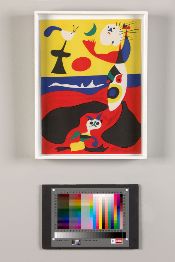
Obra de Joan Miró con IT8
Steinberg, Miro, Haring and friends.pdf
Reservados todos los derechos. © Isarrualde Photography
Prohibida toda reproducción parcial o total sin el consentimiento escrito del autor.
Felicidades por tu artículo. Me alegro que hayas dado un paso adelante y trates el par de temas que has comentado. Ya estoy un poco cansado de encontrarme artículos de fotografía en los que siempre se habla de lo mismo, del «A-B-C», de lo básico… Ya era hora de leer un artículo sobre temas importantes y que no reciben apenas comentarios en la web.
Enhorabuena!
¡ Gracias Jorge ! Intentaré seguir escribiendo sobre temas de interés.
Buenísimo! Y muchas gracias por compartir!
Gracias a ti ¡
Pingback: El difícil arte de reproducir obras de arte | El blog de Hugo Rodriguez | Pildoras diarias de tecnica fotografica
Aunque ya ha pasado un tiempo desde que escribiste este post, acabo de acceder revisando la web de Hugo Rodríguez. Quisiera hacerte una pregunta ¿tienes alguna experiencia con el uso de filtros polarizadores o polarización cruzada para reducir brillos en la fotografía de obras de arte? Saludos.
No Ángel, nunca tuve la necesidad de polarizar la luz. Saludos, Marcelo